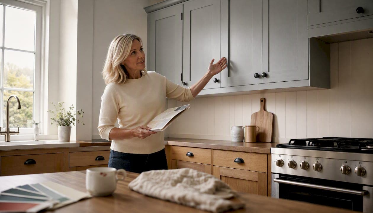
Two tone kitchen cabinets work. Put a lighter colour on the upper cabinets and a deeper or textured tone on the lowers, and you immediately add height, grounding and personality to a kitchen without touching the carcasses. Among homeowners who have made this choice, 40% pick white for the upper cabinets, 19% pick off-white and 17% select a wood tone for uppers; lower cabinets tend toward wood, green, blue and deep neutrals.
Three combinations that consistently work in UK homes:
- Classic white uppers + walnut lowers — warm, timeless, suits both shaker and slab door styles
- Neutral greige perimeter + coloured island — low commitment, high impact, easy to update later
- Tone-on-tone layered neutrals — two depths of the same hue for a bespoke, understated finish
If your carcasses are structurally sound and you simply want a new colour or finish, a professional respray is almost always the most cost-effective route. Replacement makes sense when the layout needs to change or the carcasses themselves are damaged.
Table of Contents
- What do two-tone kitchen ideas actually look like in practice?
- How do you decide which colour goes where?
- Which colour combinations work best in UK kitchens?
- Should you use the island as your two-tone accent?
- Respray, replace or reface: which route is right for you?
- How do you keep a two-tone kitchen looking good long-term?
- Key takeaways
- Why the island-first approach is the right call for most homeowners
- Get a two-tone kitchen respray in South Wales
- Useful sources and further reading
What do two-tone kitchen ideas actually look like in practice?
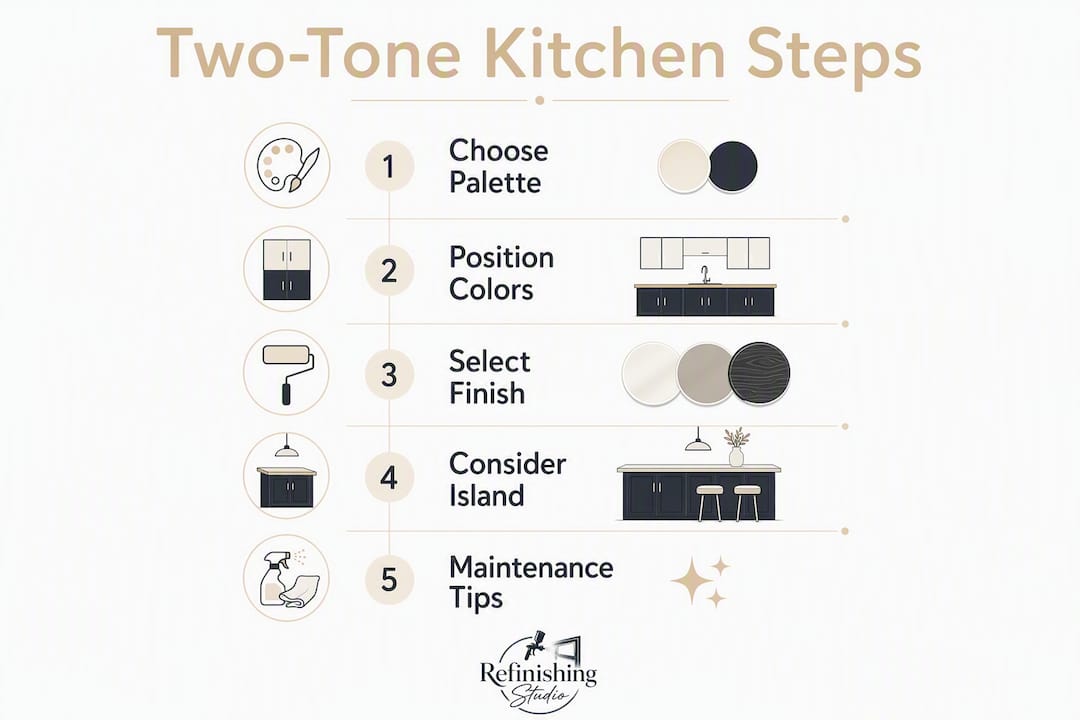
The appeal of contrasting kitchen cabinets is partly visual and partly psychological: two tones give the eye somewhere to travel, which is why the colour contrast can make a kitchen feel larger. Here are eight looks worth considering, each suited to a different kitchen style and room layout.
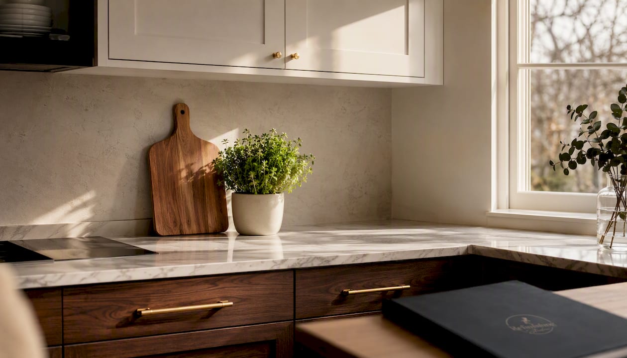
White uppers + wood lowers is the most popular split in the UK right now, and for good reason. It reads clean without feeling clinical, and the warmth of oak or walnut at worktop height softens the whole room. Works in everything from a narrow galley to an open-plan family kitchen.
Navy island + pale perimeter is the designer's shortcut to a statement kitchen. The island carries the drama; the perimeter stays calm. Suits contemporary and modern shaker styles particularly well, and photographs beautifully.
Greige + walnut is the grown-up version of the white-and-wood split. Greige (a grey-beige hybrid) sits comfortably with warm timber tones and reads as quietly sophisticated rather than trend-led.
Calke Green + natural oak is a heritage pairing that has aged well. The muted sage-green tone from Farrow & Ball's palette against raw or lightly oiled oak feels genuinely timeless rather than fashionable.
Indigo blue + white brings depth without heaviness. Ash shaker doors in Indigo Blue paired with Cashmere uppers, as seen in projects like the Sand & Water handleless shaker kitchen by Stonemill Kitchens, show how well this pairing works when the undertones are matched carefully.
Tone-on-tone blues — two shades of the same blue family — deliver a layered, bespoke look that avoids the stark contrast of a two-colour split. Better suited to larger kitchens where the subtlety reads clearly.
Pastel two-tone for period cottages — soft sage uppers with a cream or stone lower — fits the proportions and character of older UK properties without competing with original features.
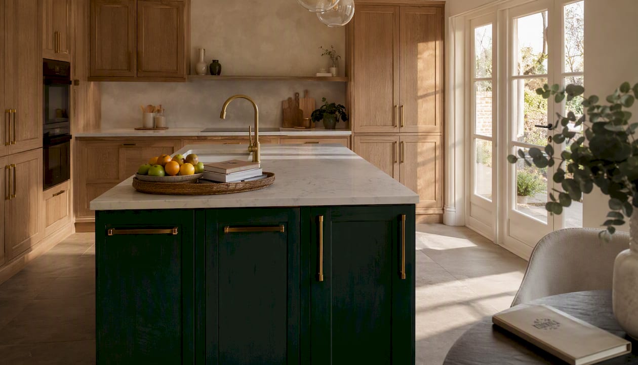
Wood perimeter + bold island is the reverse of the usual formula. Keep the perimeter in natural timber and use the island as the painted accent. It grounds the room in material warmth while still delivering a focal point.
For browsing real project photography, Howdens, Magnet and Houzz UK all maintain extensive galleries organised by style and colour — useful for building a reference board before committing to a scheme.
How do you decide which colour goes where?
The core rule is straightforward: darker tone below, lighter tone above. It grounds the room visually, draws the eye upward and prevents the kitchen from feeling top-heavy. Designers describe this as a 70/30 dominance — roughly two-thirds of the visual weight sitting in the dominant (usually lighter) colour, with the accent tone taking the remaining third.
The rule inverts in specific circumstances. Tall ceilings and generous natural light can carry a darker upper cabinet without closing the room in. A very small kitchen with low ceilings, on the other hand, benefits most from keeping the uppers as light as possible.
A practical checklist before you commit to a scheme:
- Order sample doors or paint swatches in both tones and live with them for at least a week.
- Photograph them under morning light, afternoon light and your kitchen's artificial lighting — undertones shift dramatically between these conditions.
- Hold the samples against your worktop, flooring and splashback simultaneously. You are matching undertones, not names: a "warm white" and a "cool white" will fight each other even if both sound neutral on paper.
- Check your appliance finishes. Stainless steel reads cooler; brushed brass reads warmer. Your cabinet tones need to sit comfortably alongside whichever you have.
- Decide whether you want two painted colours or a painted-plus-timber split. If you are nervous about committing to two paint colours, using a wood island or timber-effect lower doors as the second tone removes a lot of the risk.
Pro Tip: If you want the two tones to feel integrated rather than competing, match your upper cabinet colour to the wall paint. The uppers effectively disappear into the room, and the lower or island colour does all the work.
The two-tone kitchen ideas on the DIY Doors blog include practical UK-focused examples of this approach, with replacement door options if you want to change the door profile at the same time.
Which colour combinations work best in UK kitchens?
Heritage and earthy palettes are the most resilient choices for UK homes. Hague Blue paired with Strong White, and Calke Green with natural oak, are among the most consistently recommended combinations by UK designers. Both pairings use Farrow & Ball tones that have remained in demand for over a decade, which tells you something about their staying power.
| Pairing | Finish recommendation | Style fit | Resale appeal |
|---|---|---|---|
| Warm white + medium walnut | Satin uppers, oiled timber lowers | Contemporary, Scandi, modern organic | Very broad |
| Cream/khaki + smoky jade green | Eggshell or matt both tones | Shaker, period, country | Broad |
| Greige + walnut | Matt or eggshell uppers, oiled timber | Modern traditional | Broad |
| White + indigo navy | Matt or satin uppers, satin lowers | Contemporary shaker, handleless | Moderate |
| Farrow & Ball Hague Blue + Strong White | Matt or eggshell | Heritage, period, classic shaker | Broad |
| Farrow & Ball Calke Green + natural oak | Matt painted, oiled timber | Country, cottage, modern farmhouse | Broad |
| Wood perimeter + bold painted island | Oiled timber, gloss or satin island | Modern, open-plan | Moderate |
Matt finishes hide fingerprints and minor surface variation, making them the practical choice for families. Satin sits between matt and gloss: it wipes clean more easily and suits contemporary shaker styles well. Gloss amplifies colour and light but shows every mark, so it works best in low-traffic areas or on islands where drama is the point. Mixing a gloss finish with a heavily textured timber on adjacent surfaces tends to look unresolved — keep the sheen levels in the same family unless you are deliberately playing with contrast.
For a deeper look at current colour trends, Refinishingstudio's guide to the best kitchen respray colours covers popular RAL and BS options alongside finish recommendations.
The pairings with the broadest resale appeal are the ones that read as considered rather than personal: warm white with timber, greige with walnut, and the heritage Farrow & Ball combinations all sit in that category. Indigo navy and bold island colours are more personal choices — not a problem if you are staying put, but worth factoring in if you plan to sell within a few years.
Should you use the island as your two-tone accent?
For most homeowners, yes. The island is the lowest-risk place to introduce a second colour because it is a discrete element: if you change your mind, repainting an island is a far quicker, lower-disruption update than repainting the entire perimeter. It also tends to be the most photographed part of a kitchen, so the colour gets maximum visual return.
Industry reporting notes that a significant number of renovated islands have grown in size, meaning modern islands generally have the physical presence to carry a bolder colour without looking like an afterthought.
Scale checklist before committing to a bold island colour:
- The island should have at least 900mm of clear circulation space on all sides — a cramped island in a strong colour will dominate the room rather than anchor it.
- If the island seats two or more people, it has enough visual mass to carry a contrasting tone confidently.
- An island shorter than roughly 1.2 metres tends to look better in a tone-on-tone or timber treatment rather than a full contrast colour.
- Check the island's end panels and returns. If they are a different material or finish to the doors, the colour will look inconsistent — end panels need to be finished to match.
Successful island treatments in UK projects include: a navy island against a white shaker perimeter with brass bar handles (classic, broadly appealing); a forest green island against a pale oak perimeter (modern organic, works well in open-plan spaces); and a textured timber island against painted perimeter cabinets (adds material warmth without a second paint colour). Refinishingstudio's forest green island respray in Cardiff shows what a bold island treatment looks like with a factory-standard hand-spray finish.
Respray, replace or reface: which route is right for you?
The direct answer: if your carcasses are structurally sound and you want a new colour, finish or two-tone scheme, a professional respray delivers the result at a fraction of the cost of replacement. Replacement makes sense when the layout needs to change, the carcasses are damaged, or you need new integrated appliances that require a different cabinet configuration. Refacing (replacing doors and drawer fronts while keeping the carcasses) sits between the two: it changes the door profile but not the colour of the carcass interiors.
Durability is where professional application separates itself from DIY. A factory-standard hand-spray finish bonds to the substrate differently from a brush-applied coat, and the difference shows over time, particularly on high-traffic surfaces like lower cabinet doors. For a two-tone scheme, this matters even more: two finishes applied at different quality levels will age at different rates and start to look mismatched within a few years.
On cost, a professional kitchen respray in the UK typically costs significantly less than a full replacement kitchen. The price varies based on the number of doors, drawer fronts, end panels, whether the island is included and whether you are adding a handleless conversion. Refinishingstudio's kitchen respraying cost guide gives South Wales homeowners a realistic starting point for budgeting.
One technical point worth checking before you instruct any contractor: handleless conversions require edge treatment and door profile planning. A handleless visual added as an afterthought — without matching the end panels and returns — looks unplanned. Ask your contractor specifically how they handle edge finishing and whether the end panels are included in the quote.
Refinishingstudio's kitchen cabinet spraying service covers cabinets, doors, drawer fronts, end panels, islands and handleless conversions, with a five-year transferable warranty on all work. The cost and benefit breakdown is worth reading if you are still weighing respray against replacement.
How do you keep a two-tone kitchen looking good long-term?
Finish choice is the biggest factor in how easy a two-tone kitchen is to live with. Matt finishes look beautiful but need gentle cleaning — abrasive cloths or harsh sprays will dull the surface over time. Satin and eggshell are more forgiving: a damp cloth with mild detergent handles most kitchen grime without damaging the finish.
Gloss cabinets show fingerprints and water marks more readily than matt or satin, so they need more frequent wiping. If you have gloss on the island and matt on the perimeter, build two slightly different cleaning routines rather than treating all surfaces the same way.
For painted versus stained timber surfaces in the same kitchen, the key rule is to avoid cross-contamination of cleaning products. Oil-based cleaners used on timber can migrate onto adjacent painted surfaces and affect the finish over time. Keep them separate.
Pro Tip: For a detailed comparison of how matt, satin and gloss finishes perform in real kitchens, Refinishingstudio's guide to matt vs satin vs gloss covers the practical trade-offs clearly.
Hardware is the detail that ties two tones together or pulls them apart. Bar pulls in brushed nickel, matte black or brushed gold are the current workhorses of two-tone kitchen design — each reads differently against the same cabinet colours. Brushed nickel sits comfortably with cool whites and blues; matte black anchors bolder, more graphic schemes; brushed gold warms up heritage and earthy palettes. The colour combination guide from Happy Doors includes practical hardware pairing advice alongside colour combinations.
Lighting deserves more attention than most homeowners give it at the planning stage. Under-cabinet task lighting will hit your lower cabinet doors directly, which can shift how the colour reads — a navy that looks rich and deep in ambient light can appear almost black under a cool LED strip. Test your swatch samples under the actual lighting conditions in your kitchen, not just by a window.
Key takeaways
Two-tone kitchen cabinets deliver high visual impact at lower cost than replacement, with the island as the lowest-risk starting point for a second colour.
| Point | Details |
|---|---|
| Placement rule | Lighter tone on uppers, darker or textured tone on lowers grounds the room and draws the eye upward. |
| Proportion rule | Follow the 70/30 split: roughly two-thirds dominant colour, one-third accent, to avoid a visual clash. |
| Island as accent | The island is the easiest element to update and can carry a bolder colour when it exceeds roughly 1.2 metres in length. |
| Finish and undertones | Match undertones across both tones and keep sheen levels consistent; test swatches under your kitchen's actual lighting before committing. |
| Refinishingstudio | Professional hand-spray respraying in South Wales delivers factory-standard two-tone finishes with a five-year transferable warranty, at a fraction of replacement cost. |
Why the island-first approach is the right call for most homeowners
Most design guides treat two-tone kitchens as a colour decision. The colour matters, but the more consequential choice is where you put the second tone and how it is applied.
The island-first approach works because it limits the blast radius of a decision you might want to revisit. A perimeter respray in a bold colour is a bigger commitment than an island respray, not because it costs dramatically more, but because it changes the entire room's character. An island in a strong colour changes one element. That distinction shapes how confident you can be going in.
What most articles miss is the finish compatibility point. Two colours applied at different quality levels will age differently, and in a two-tone scheme that mismatch becomes visible faster than it would in a single-colour kitchen. The upper and lower finishes need to be applied with the same process, the same product and the same level of surface preparation — otherwise the scheme starts to look tired on one side before the other. This is the practical argument for using a single contractor for both tones rather than painting one yourself and having the other professionally sprayed.
The heritage palette advice is also more than aesthetic conservatism. Muted greens, indigo blues and warm whites with oak or walnut have remained in demand in the UK market for long enough that they are genuinely safe bets for resale. Bright primary contrasts are not — they read as a moment in time rather than a considered choice, and buyers notice.
Get a two-tone kitchen respray in South Wales
Refinishingstudio specialises in professional hand-spray kitchen resprays across South Wales, and a two-tone finish is one of the most requested outcomes. The service covers cabinet doors, drawer fronts, end panels, islands and handleless conversions, with a full choice of RAL, BS and custom colours across matt, eggshell, satin and gloss finishes.
Every project is quoted individually, carried out without subcontractors, and backed by a five-year transferable warranty. The cost is a fraction of a full kitchen replacement, and the disruption is minimal compared to a refit. If you want to see what a factory-standard two-tone finish looks like in a real South Wales kitchen, the project portfolio is the place to start.
To get a quote or discuss your two-tone scheme, visit the kitchen respraying service page or use the contact form to request a survey. Pricing guidance is available on the kitchen respraying cost page.
Useful sources and further reading
- Houzz UK kitchen gallery — real project photography organised by style, colour and room size
- Sand & Water two-tone handleless shaker kitchen — Stonemill Kitchens — a detailed UK project example showing Indigo Blue and Cashmere in a handleless shaker format
- Refinishingstudio kitchen respraying service — service overview, process and warranty details for South Wales homeowners
- Refinishingstudio kitchen respraying cost guide — pricing guidance for two-tone respray projects
- Refinishingstudio finishes guide — matt, eggshell, satin and gloss options with technical detail
- Refinishingstudio project portfolio — completed kitchen and UPVC resprays across South Wales