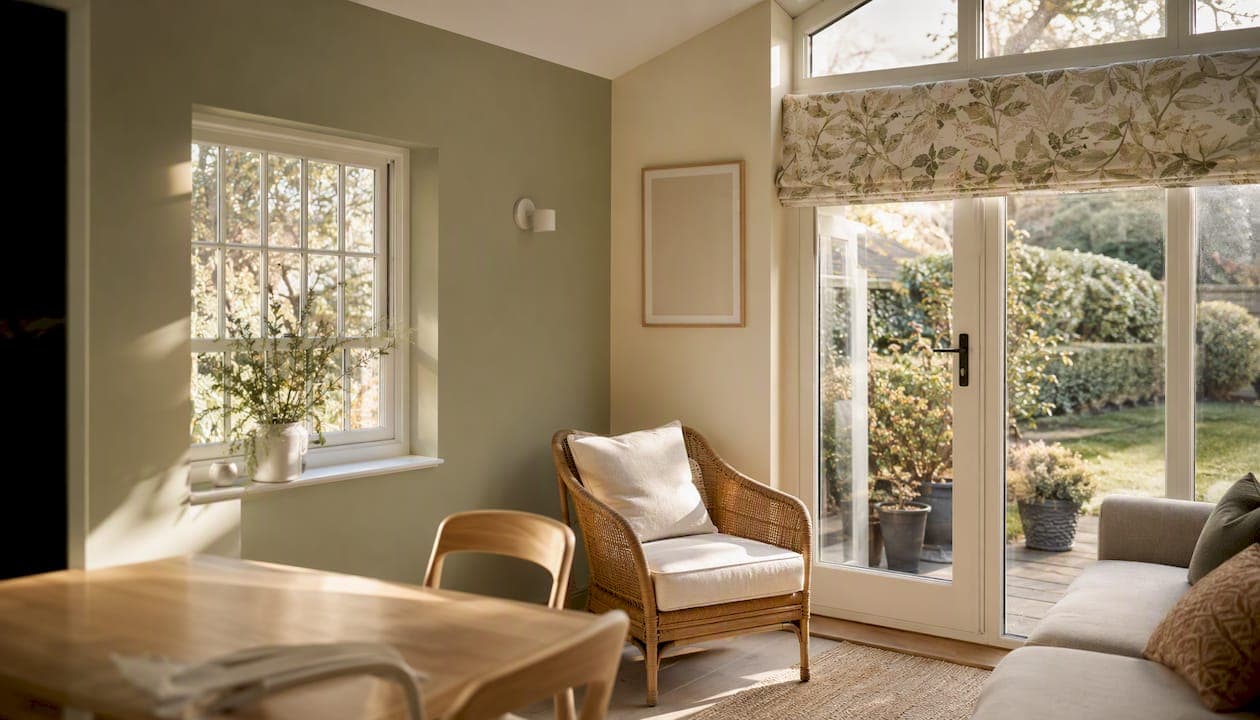
Soft neutrals, muted greens and earthy tones are the safest, most versatile conservatory colour choices for 2026, and they work because they echo what's already outside the glass. Start by testing two high-LRV neutrals and one muted green on your dwarf wall and ceiling, then check them at three different times of day before you buy a single tin.
That's the short version. Here's how to apply it properly, whatever shape or aspect your conservatory happens to be.
- Small or north-facing conservatory: go for a light neutral with a high Light Reflectance Value (LRV) above 70, such as a soft off-white or warm greige, to bounce around whatever daylight you get.
- Garden-facing or plant-filled conservatory: a muted sage or olive green ties the room to the view outside and reads as calm rather than cold, even under grey skies.
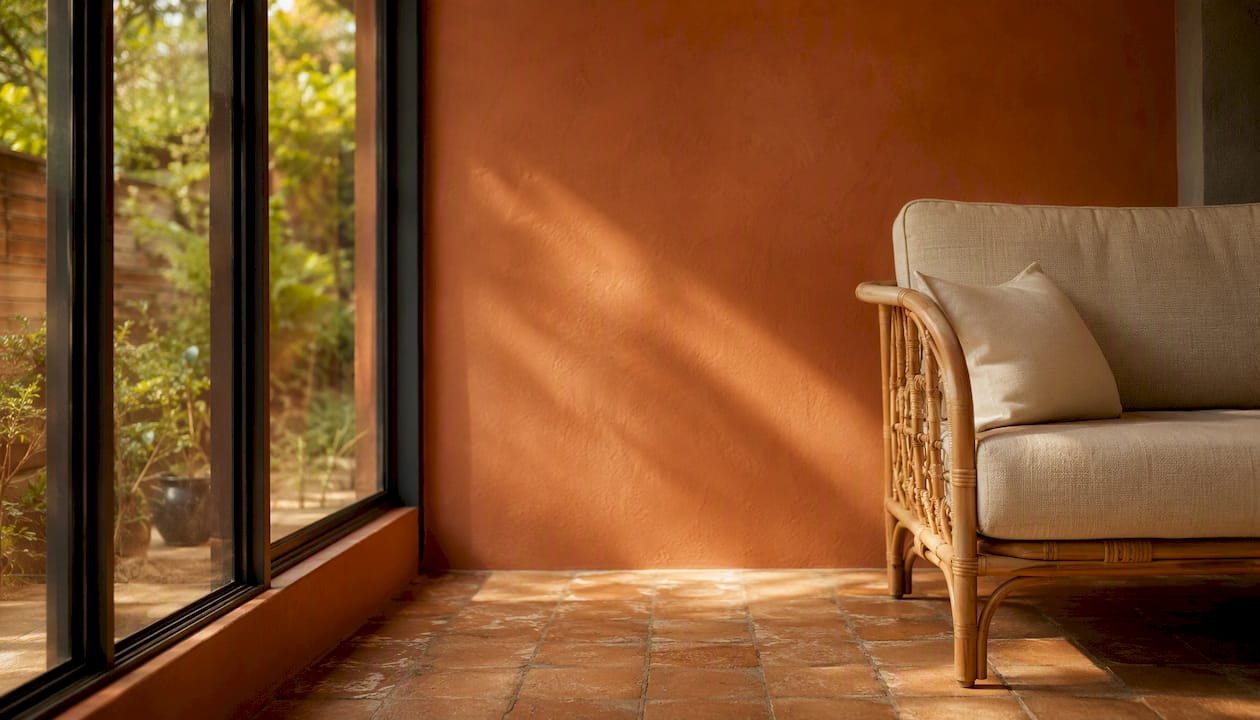
- South-facing or sun-trap conservatory: warm terracotta or muted clay brings a Mediterranean feel without fighting the heat, since darker warm tones absorb glare more comfortably than stark white.
Pro Tip: Buy sample pots, not swatches. Paint two A2-sized boards, prop one against the dwarf wall and one flat on a section of ceiling, then photograph both at 9am, 1pm and dusk. Conservatory light shifts more than any other room in the house, and a colour that looks perfect at lunchtime can turn grey and flat by evening.
Key Takeaways
Conservatory colour schemes work best when soft neutrals, muted greens and earthy tones anchor the walls, tested on-site under real light before any paint is bought.
| Point | Details |
|---|---|
| Test before you commit | Paint large sample boards and check them at three times of day against your actual garden view. |
| Pick palette by aspect | Use high-LRV neutrals for north-facing or small rooms, terracotta for sun-filled south-facing spaces. |
| Match finish to surface | Choose washable eggshell for walls, UV-stable satin for rooflines, and specialist coatings near the coast. |
| Complement, don't match, fabrics | Pair blinds and furniture in tones close to the wall colour rather than identical shades. |
| Hire a professional for frames | Refinishing Studio's hand-spray respray carries a five-year warranty for UPVC, aluminium and timber frames across South Wales. |
Table of Contents
- Conservatory colour scheme ideas for every layout
- How does light change the way conservatory colours look?
- Which paint and finish work best on conservatory surfaces?
- Small conservatory colour tips that actually work
- Matching blinds, fabrics and furniture to your wall colour
- Does conservatory colour affect how warm the room feels?
- Style-led conservatory palettes with paint suggestions
- When is a professional respray the better choice for conservatory frames?
- Sources
Conservatory colour scheme ideas for every layout
Most conservatory colour disasters come from picking a shade in a paint shop and assuming it will behave the same way under a glass roof. It won't. Below are five ready-made palettes that have proved reliable across different room shapes and orientations, each with a clear use case.
Calm neutral (walls: soft off-white or warm greige, roofline: matching or one shade lighter). This is the low-risk, universally flattering option. It suits small conservatories, rooms with limited natural light, and anyone nervous about committing to colour. Pair it with natural linen blinds and light oak or rattan furniture.
Botanical sage. A muted, greyed-down green on the walls creates what designers increasingly describe as a biophilic link between the interior and the garden, avoiding the starkness of plain white. It works best in conservatories that look directly onto planting, and it's forgiving on north or east aspects where cooler light won't wash it out.
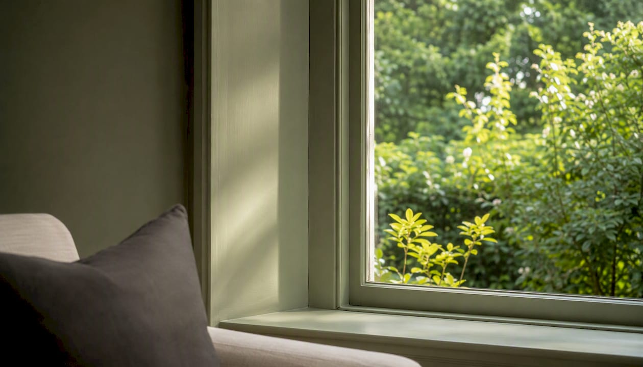
Coastal blue. A soft, dusty mid-blue rather than anything saturated. This palette suits conservatories with a sea view or a coastal garden feel, and it pairs naturally with woven textures and driftwood-toned furniture. Reserve it for rooms that get reasonable daylight, since strong blues can feel heavy in dim corners.
Warm terracotta. Best reserved for south-facing or larger conservatories where there's enough space and light to carry a warmer, more saturated wall colour. It suits tiled or terracotta floors and rattan seating particularly well, and it reads as a genuine style statement rather than a safe default.
Modern slate. A deep charcoal or graphite grey, usually confined to a single feature wall or the dwarf wall beneath the glazing rather than the whole room. This is the boldest option on the list and suits larger, well-lit conservatories with contemporary furniture. Keep the ceiling pale to stop the space feeling closed in.
How does light change the way conservatory colours look?
A conservatory behaves nothing like a normal room when it comes to colour, because glass on three or four sides means the light hitting your walls changes constantly through the day and across the seasons. A north-facing conservatory receives flat, cool, consistent light, which tends to make warm colours look muted and cool colours look colder still. A south-facing conservatory gets strong, warm, high-contrast light that can bleach pale colours at midday and turn them golden at dusk. East and west aspects sit somewhere between the two, shifting from cool morning light to warm evening light within a matter of hours.
This is why a colour card in a shop, lit by fluorescent tubes, tells you almost nothing useful about how that shade will behave under your specific roof.
Here's a testing sequence that actually works:
- Buy sample pots in your two or three shortlisted colours, not just swatches. Paint charts distort colour more than most people realise.
- Paint a large sample board at least A2 in size for each colour rather than painting directly onto the wall, so you can move it around and compare shades side by side.
- Place the boards in at least two locations, one on the dwarf wall and one held up near the ceiling line, since roof colour often reads darker than wall colour under glass.
- Observe at three points in the day, morning, early afternoon and dusk, and note whether the colour shifts warmer, cooler, greyer or more saturated.
- Photograph each observation on your phone with flash turned off, so you have a record to compare once natural light has changed.
- Check the colour against your garden view, holding the sample close to the glazing to see how it sits alongside whatever greenery or paving is visible outside.
Pro Tip: If your conservatory is south-facing, lean towards higher-LRV neutrals rather than mid-tones. Pale colours reflect more heat and glare, which keeps the room feeling brighter rather than washed out, and they tend to hold their undertone better against strong sun than mid-depth colours do.
Which paint and finish work best on conservatory surfaces?
Conservatory walls, ceilings and frames each face different stresses, condensation on the glazing, UV exposure through unshaded glass, and temperature swings that ordinary living-room paint was never designed to handle. Getting the finish right matters as much as getting the colour right.
For interior walls, a washable eggshell or modern eggshell finish generally outperforms flat matt, because it resists the humidity that builds up around glazed extensions and wipes clean without burnishing. Where condensation is a regular issue, trade guidance points towards finishes with a Class 1 scrub rating and anti-mould additives, which hold up far better over a damp winter than a standard contract matt.
Ceilings and rooflines need particular care if they're timber-lined, since UV exposure through unshaded glass is far more intense than in a normal room. A satin or eggshell finish with UV-stable pigments will fade more slowly than a cheaper matt emulsion. For exposed timber trim, Sadolin's guidance recommends transparent stains where you want to keep the grain visible, and opaque woodstains or trade-grade opaque finishes where full colour coverage and maximum weather resistance matter more.
| Surface | Recommended finish | Key consideration |
|---|---|---|
| Interior plaster walls | Washable eggshell, Class 1 scrub | Resists condensation and wipes clean |
| Timber roofline/ceiling | Satin or eggshell, UV-stable | Slows fading from unshaded glazing |
| Exposed brick/dwarf wall | Masonry paint or breathable masonry system | Needs breathability to avoid trapping damp |
| External timber trim | Opaque woodstain or transparent stain | Choose opacity based on whether grain should show |
| UPVC frames | Factory-grade sprayed finish | Best applied professionally for durability |
If your conservatory sits within reach of salt air, coastal exposure changes the calculation entirely. Intense UV and salt spray accelerate fading and put more stress on darker, highly saturated finishes, which is why softer, dusty mid-blues and washable whites perform better long-term on coastal exteriors than bold, deep colours. Preparation matters just as much as the paint itself: specialist waterproofing masonry products and thorough removal of salt deposits before painting are essential to stop coatings failing prematurely near the coast.
Small conservatory colour tips that actually work
A small conservatory doesn't need a total rebuild to feel bigger. It needs a handful of deliberate colour and finish decisions that most people get backwards.
- Keep the ceiling and upper walls in a high-LRV neutral, ideally the palest shade in your scheme, so the eye reads the space as open rather than boxed in by a dark roofline.
- Go one or two shades deeper on the dwarf wall than the rest of the room. A slightly grounded base wall stops a small conservatory feeling like it's floating, which counterintuitively makes it feel more spacious rather than less.
- Choose a single tone for window and door trim rather than a contrasting colour, since visual busyness at the frame line is one of the fastest ways to make a compact room feel cluttered.
- Swap heavy patterned rugs for pale, plain flooring or light-toned tiles, and let one or two textured accents (a woven basket, a linen cushion) do the visual work instead.
- Add one reflective surface, a mirror, glass-topped table or metallic lamp base, to bounce light around rather than absorb it.
Matching blinds, fabrics and furniture to your wall colour
The instinct to match blinds exactly to your wall colour is one of the most common mistakes in conservatory decorating, and it rarely looks as good as people hope. A blind cut from the same paint chip as the wall tends to flatten the whole room, removing the tonal depth that makes a scheme feel considered rather than accidental.
The better approach is to complement rather than match. Current guidance on conservatory blind pairings recommends choosing a blind fabric that sits close to the wall colour on the colour wheel but isn't identical, creating a layered look that softens glare without looking flat. A sage green wall, for instance, works beautifully with a warm oatmeal or stone linen blind rather than another shade of green.
Fabric type matters almost as much as colour. Light-filtering linen or cotton blends suit calm neutral and botanical palettes, letting daylight through while softening it. Heavier woven textures or blackout linings suit bolder palettes like modern slate or coastal blue, where you might want more control over glare on bright days. A dependable combination that keeps coming up in well-finished conservatories: muted green walls, neutral linen blinds, and rattan or woven seating, which together avoid the sterile feel that an all-matching scheme often produces.
Pro Tip: Before ordering full-length blinds, request a fabric swatch and hold it against your painted sample board in the same conditions you tested your paint, morning, afternoon and dusk. Fabric reads differently under glass than paint does, and a swatch that looked warm in the shop can turn distinctly cool once it's hanging against south-facing glazing.
Does conservatory colour affect how warm the room feels?
Colour genuinely changes how a conservatory feels temperature-wise, not just visually but psychologically. Cool tones such as pale blues, green-greys and soft whites tend to make a glazed room feel cooler and calmer in summer, which is useful if your conservatory gets uncomfortably warm on sunny afternoons. Warmer tones, muted clay, soft terracotta, plaster pink and warm off-whites, do the opposite, lifting the perceived warmth of the room through darker winter months when the light outside is flat and grey.
You don't need to repaint twice a year to take advantage of this. A few seasonal swaps do most of the work:
- Swap cool linen cushions for warmer wool or bouclé textures once the clocks go back, without touching the walls at all.
- Introduce a rust, ochre or deep green throw for autumn and winter, then pack it away for lighter cottons in spring.
- Add a couple of terracotta or amber-toned accessories, a vase, a candle holder, to nudge a neutral scheme warmer without repainting.
- Layer in warm-white artificial lighting for evenings, since cool LED bulbs can make even a warm wall colour look clinical after dark.
Artificial light matters more in a conservatory than in most rooms, because the transition from daylight to dusk happens so visibly through all that glass. A warm-toned lamp or a dimmable pendant will shift a muted green or terracotta wall towards a cosier glow in the evening, while a cool white bulb can leave the same colour looking flat and slightly grey once the sun's gone down.
Style-led conservatory palettes with paint suggestions
If you want a concrete shortlist rather than a colour theory lesson, these four style directions each come with named shades to take to a paint shop or hand to your decorator.
Modern neutral. Soft off-whites and warm greiges, such as Farrow & Ball's Joa's White, in a modern eggshell finish. Suits any aspect, pairs with pale oak, linen and matt black hardware.
Heritage traditional. Muted stone and soft sage tones, similar in spirit to Farrow & Ball's Cromarty, applied in eggshell on walls with a slightly deeper tone on the dwarf wall. Suits period properties and pairs naturally with rattan, brass fittings and floral or botanical fabrics.
Coastal. A soft, dusty mid-blue such as a washed denim or seaglass shade, paired with crisp white trim and woven natural fibres. Best on rooms with a garden or coastal-adjacent view, and best avoided on very dark or north-facing conservatories where blue can read cold.
Botanical. Muted sage or olive green walls, echoing the anthracite-frame-and-sage-interior pairing that's become popular for garden-facing conservatories, with terracotta pots and rattan furniture completing the look.
| Style | Example shade family | Recommended finish | Best aspect |
|---|---|---|---|
| Modern neutral | Off-white / warm greige | Modern eggshell | Any, especially north-facing |
| Heritage traditional | Stone / muted sage | Eggshell | East or west-facing |
| Coastal | Dusty mid-blue | Eggshell or satin | South or garden-facing |
| Botanical | Sage / olive green | Eggshell | Garden-facing, any light level |
Durability is worth weighing alongside looks. Paints formulated with UV-stable pigments and washable finishes consistently outlast standard contract-grade emulsion in conservatory conditions, which is why the shades on most reputable conservatory-specific colour lists lean towards eggshell and satin rather than flat matt.
When is a professional respray the better choice for conservatory frames?
Repainting walls is a weekend job most homeowners can tackle themselves. Changing the colour of UPVC frames, roofline trim or aluminium glazing bars is a different proposition entirely, and it's where DIY paint jobs most often go wrong.
Standard wall paint and even most exterior masonry paints won't bond properly to UPVC or aluminium without the correct primer system and surface preparation, and a poor bond means peeling, chipping or yellowing within a year or two. That risk climbs further in coastal or exposed locations, where salt deposits need thorough removal before any coating goes on, and where a lower-spec finish is more likely to fail early. If your conservatory frames face heavy sun, salt air, or you simply want a colour change that will last, a professional hand-spray respray is the more reliable route.
A proper respray job, the kind Refinishing Studio carries out across South Wales, typically includes full surface preparation, a factory-standard hand-spray application in your chosen RAL or BS colour, a choice of matt, satin or gloss finish, and a five-year transferable warranty backing the work. That warranty matters: it's the difference between a DIY job that might last a season and a specified finish designed to hold its colour and adhesion for years.
Before booking anyone for a respray, a few things are worth checking:
- Ask whether the quote includes full masking, degreasing and priming, not just the spray coat itself.
- Confirm the warranty length and what it actually covers, chipping, fading, peeling, and whether it transfers if you sell the property.
- Request examples of previous conservatory or UPVC respray work in a similar colour to the one you're considering.
- Check whether the job is subcontracted or carried out directly by the company you're speaking to.
- Ask about typical turnaround time from survey to completed spray, and whether the conservatory needs to be vacated during the process.
A note from the team on getting conservatory colour right
Every conservatory project we've worked on across South Wales has the same underlying tension: homeowners want a colour that feels current, but they're understandably nervous about it looking dated or garish once the light changes through the seasons. What consistently reassures people is testing properly before committing, painting a real sample board, watching it at different times of day, and holding it against the garden view rather than trusting a colour chip under shop lighting.
The most common concern we hear isn't really about colour at all, it's about durability. Homeowners have often seen a neighbour's UPVC frames yellow or peel within a couple of years of a badly done respray, and that fear is entirely reasonable given how often the wrong primer or finish gets used. have shaped how we approach every job, insisting on proper preparation before a single coat goes on. reflect what we hear most often from clients once the work is finished: that the finish looks and feels factory-made, not painted on.
Ready to change your conservatory frame colour for good?
Repainting walls and swapping blinds gets you most of the way to a refreshed conservatory, but frame colour is where most DIY attempts fall down, since UPVC and aluminium need proper preparation and specialist coatings to hold their finish. Refinishing Studio sprays UPVC, aluminium and timber conservatory frames and roofline across South Wales, using a factory-standard hand-spray technique backed by a five-year transferable warranty, at a fraction of the cost of full replacement.
The process is straightforward: a site survey to assess your frames and confirm colour options, a fixed quote, the hand-spray application itself, then a full walkthrough before you sign off. Most domestic conservatory jobs are completed within a day or two once scheduled. Browse colour and RAL options or view the conservatory spraying service page to see recent portfolio examples and get a quote for your own project.
Sources
- Top 12 Conservatory Paint Colours UK Durable 2026
- 2026’s Most Popular Paint and Blind Colour Combinations for Conservatories
- The best exterior colours for a coastal home
- How to decorate coastal properties